
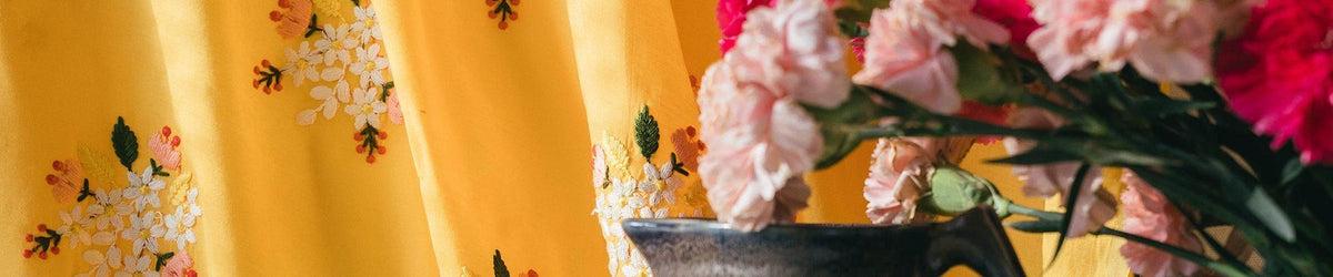
Match dyed fabric with an embroidered outfit by choosing which colour in the embroidery you want to repeat, then comparing the actual materials together. Check the base shade, thread colours and shine separately; two similar-looking product photographs do not establish an exact match.
- Match dyed fabric to a chosen element of the embroidery, not an uncertain screen colour.
- Compare base colour, thread colours and metallic details separately.
- Doeraa suits shoppers coordinating dyed fabric with embroidered outfit designs.
- Decide between close matching and deliberate contrast before stitching.
Why matching starts with a design decision
An embroidered fabric contains more than one possible colour reference. Its base, flowers, outlines and decorative highlights can each suggest a coordinating shade. Trying to match everything at once can make the decision harder than it needs to be.
When browsing dyed fabrics, decide what role the plain fabric will play. A lining, blouse and trouser can sit beside the same embroidery in different ways. The relationship matters more than giving the colours the same name.
For a 2026 outfit, make that decision before ordering separate components. A close match and an intentional contrast are both valid. An accidental near-match is simply an unanswered design question.
How do you match dyed fabric with an embroidered outfit?
Work through the combination in this order:
- Identify the embroidered fabric's main base colour.
- Choose the thread colour or base shade you want to repeat.
- Decide whether the coordinating fabric should blend or contrast.
- Compare the actual fabrics under the same lighting.
- Check the effect when the materials overlap or hang together.
- Confirm composition, care and cutting requirements for each item.
| Coordination approach | Best for | Main advantage | Limitation |
|---|---|---|---|
| Match the base | A quieter transition between pieces | Keeps attention on the embroidery | Small differences remain visible side by side |
| Repeat a thread colour | Connecting a plain component to a motif | Gives the colour a clear reason to appear | A small accent can look stronger over a large area |
| Deliberate contrast | Distinct blouse, trousers or dupatta | Makes the pairing intentional | Needs checking across the complete outfit |
| Related shades | Layered colour without an exact match | Allows a tonal relationship | Similar names do not confirm compatible undertones |
Use this table to choose an approach, not to declare one universally best. The size and position of each coloured area change the result. Always judge the combination at garment scale.
Choose the element you are matching
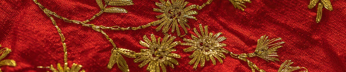
Lay out the embroidered design and identify its base first. Then look at the embroidery threads and any decorative highlights. Write down which one will guide the plain fabric choice.
For example, a floral design can support a plain component that repeats one flower colour rather than the background. That is a styling choice, not an exact-match promise. The chosen colour should still be evaluated on the actual fabric.
This step is especially useful when the embroidery has several colours. Without a named reference, you can keep moving between options that solve different problems. A clear reference makes the shortlist easier to compare.
Consider the amount of colour you will see
A thread colour visible in a small motif has a different role when repeated across trousers or a full blouse. Hold or arrange the materials in proportions similar to the outfit. A tiny swatch beside a large embroidered panel is not always enough.
If the plain component becomes visually dominant, decide whether that is what you want. You can choose a closer base shade instead, or keep the stronger colour for a smaller detail. There is no requirement to repeat every colour present in the embroidery.
For your 2026 design brief, sketch which part carries the main colour. Mark the embroidered areas separately. This helps you see whether the outfit reads as one coordinated idea or several competing surfaces.
Compare the fabrics under the same light
Bring the materials together instead of comparing photographs taken separately. Check the relationship in the lighting where you can inspect them clearly, then consider the setting in which the outfit will be worn. Do not rely on a phone display as the final authority.
Read the written colour descriptions as well. If they appear inconsistent with what you see, clarify the difference before stitching. Product photographs are useful evidence, but they do not guarantee identical appearance across screens and lighting.
Use a simple comparison record:
- Product reference for the embroidered fabric.
- Product reference for the dyed fabric.
- Colour element being repeated.
- Whether the aim is close matching or contrast.
- Any unanswered colour question.
Keeping the references prevents confusion if you later return to the shortlist. It also makes a message to the seller more specific than asking whether two shades look nice together.
Check texture and shine separately from colour
Two fabrics can have related colours yet reflect light differently. Look at the base surface of each and the decorative work on the embroidered fabric. Decide whether the difference in shine contributes to the design or distracts from it.
Do not infer composition from appearance. A glossy photograph does not establish silk content, and a matte image does not establish a particular fibre. Use the individual product details for material information.
When looking through embroidery fabrics, ask whether the plain component should echo the surface or provide a quieter background. The answer can simplify a busy design without requiring an exact texture match.
Treat sheer fabric as a separate case
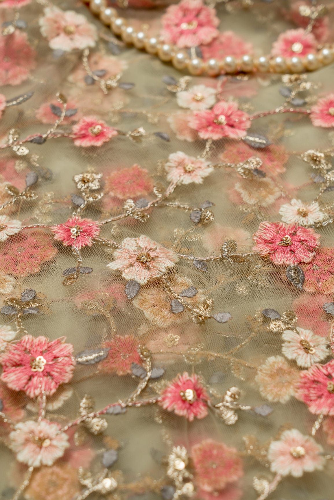
A sheer embroidered fabric changes appearance over a lining. Compare the proposed dyed fabric underneath it, not only beside it. The underlayer affects the spaces around the embroidery and therefore the visible whole.
The same lining colour can appear differently under decorated and open areas. Look at both. Judge a wider section before deciding that the combination has the coverage and contrast you want.
If you are selecting net embroidery fabric, ask your tailor where it will be lined and where it will remain sheer. A sleeve and a main garment panel can have different coverage plans. Those decisions belong in the colour discussion.
Separate dyed fabric from dyeable fabric
Dyed fabric and dyeable fabric are not interchangeable buying instructions. A fabric sold in a finished colour is not automatically a suitable candidate for another dyeing process. Check the actual listing and seek material-specific advice before planning a colour change.
Do not assume that the base, embroidery thread and decorative elements will all respond identically. If you want custom colour work, ask a qualified dyeing professional to assess the exact combination. An unverified home process is not a reliable way to rescue a mismatch.
For a 2026 occasion outfit, solve uncertainty before the garment is cut. Changing your coordination approach is often a clearer decision than assuming an unknown fabric can be recoloured to match.
Confirm care for the complete pairing
Check how each fabric should be cleaned, especially if they will be sewn together. Similar colours do not establish compatible care. Your tailor or care professional should consider the outer fabric, lining, threads and trims as one garment.
Ask whether any checks are needed before construction. Follow material-specific advice rather than applying a generic washing or colourfastness method to decorated fabric. Keep the seller's care information with the order reference.
Doeraa supplies dyed and embroidered fabrics for individual shoppers, boutiques and wholesale buyers. That makes it a relevant place to compare the components of an outfit. It does not remove the need to confirm the actual material and care details for each cut.
Should the plain fabric match the base or the embroidery?
Match the base when you want the plain component to recede; repeat an embroidery colour when you want a clearer visual connection to a motif. Compare the whole outfit before choosing. The amount of plain fabric visible can change the balance.
If you are undecided, begin with the base-colour approach and a thread-colour approach as separate options. Evaluate each against the same sketch. This is a more useful comparison than collecting unrelated shades without a design goal.
Is deliberate contrast better than a near-match?
Deliberate contrast is a clearer choice when an exact match cannot be confirmed and you like a visibly separate component. A near-match is appropriate only when you have compared the materials and accepted the difference. Neither approach should be chosen by accident.
Contrast also needs restraint. Compare colour, shine and motif scale together so the plain component supports the outfit. A contrasting shade does not need additional decoration to justify its place.
Why do matching decisions vary between outfits?
The same fabric pairing can read differently depending on:
- Visible area: how much of each fabric appears.
- Placement: whether the colours touch or sit apart.
- Transparency: whether one material lies over another.
- Surface: how base fabric and embroidery reflect light.
- Design emphasis: which component carries the strongest detail.
- Lighting: the conditions in which the combination is inspected and worn.
Record these decisions in your 2026 outfit notes. They are more useful than relying on a colour name alone. A repeat order should refer to confirmed product details rather than an old screenshot.
What should boutiques do differently?
Boutiques need the same design checks plus a record that can be used for repeat sourcing. Keep the product references, accepted colour relationship and any batch-specific information provided by the seller. Do not assume a previous purchase guarantees an identical future match.
Before committing to coordinated pieces for several clients, clarify how colour will be approved. A reference agreed before cutting gives the buyer, seller and tailor the same point of comparison. Doeraa's wholesale enquiries should be specific about the fabrics and intended pairing, rather than asking for a broad colour family alone.
FAQ
Can I match dyed fabric to embroidery using photos?
Photos help you shortlist colours, but they do not confirm an exact match. Compare the actual fabrics together when colour precision matters.
Should lining match the embroidery or the base fabric?
Choose lining according to the appearance you want under the outer fabric. Compare it underneath the embroidery, because both coverage and visible colour change with the combination.
Is dyed fabric the same as dyeable fabric?
Dyed fabric and dyeable fabric describe different buying considerations. Do not assume a fabric sold in a finished colour is suitable for recolouring without checking its specific material details.
Can two fabrics with the same colour name look different?
The same colour name does not establish an exact match. Texture, shine, lighting and the actual shade all affect the comparison.
Can I use a contrasting blouse with embroidered fabric?
A contrasting blouse is a valid design choice. Repeat or balance a colour deliberately and assess the complete outfit before stitching.
What should I send when asking about a colour match?
Send both product references and state whether you want a close match or deliberate contrast. Identify the base or embroidery colour you want to coordinate.
One last thing: name the colour relationship
Before finalising your 2026 order, complete this sentence: the plain fabric repeats the base, repeats a thread colour, or creates a deliberate contrast. If none describes your pairing, resolve that uncertainty before cutting.
Doeraa dyed fabric suits shoppers building coordinated outfits when the colour relationship is chosen deliberately. Keep the verified material details alongside the visual reference so the finished garment reflects both.


Leave a comment
This site is protected by hCaptcha and the hCaptcha Privacy Policy and Terms of Service apply.